London 1966-69
Compiled by Michael Organ, with the assistance of Nigel Waymouth
Nigel Waymouth (b.1941) and Martin Sharp (1942-2013) were two of the many young artists drawn to London between 1966 and 1969, at the height of the so-called Swinging Sixties and as satirised in the original Austin Powers movie. They produced some of the most significant psychedelic posters and artworks of the period, with many now considered classics of the genre and housed in international art galleries and museums. A recent cover story on Waymouth in the British music nostalgia magazine Shindig highlighted the artist's involvement in the London music, fashion and art scene at a time when Swinging London was a reality and the city was the centre of an artistic maelstrom. This young man and his colleagues were at the forefront of a revolution in graphic design, and their influence remains to this day.

Nigel Waymouth is best known for his role in setting up the influential and 'hip' clothing boutique Granny Takes a Trip on King's Road, London, during 1966, and for his poster and graphic design work with Michael English. He has also achieved subsequent fame in the areas of portraiture and photography. Waymouth and English operated for a brief period under the monika Hapshash and the Coloured Coat, and between 1966-8 were involved in the production of a graphically intense and brightly coloured suite of music and event posters which lit up the streets of London and venues thereabout. The posters were nothing less than works of art which also pushed the bounds of then current printing techniques in their efforts to reproduce the colours and vibrancy of the psychedelic experience.
Also in London at the time was Australian born artist Martin Sharp who is likewise known for his work with the Big O Posters company and chief graphic designer on the magazine OZ, published in Australia between 1963-9 and London between 1967-73. Both Waymouth and Sharp were unique talents and have left a substantial legacy. Their work is different to, but supplements that of like-mined colleagues abroad, most notably American graphic artists such as Stanley Mouse, Ric Griffin and Victor Moscoso whose posters for music and performance venues such as the Fillmore and Avalon Ballroom helped define the psychedelic genre. This was happening at the same time as their English, Australian, European and even Japanese counterparts were reflecting the spirit of the time. All these poster artists were influenced not only by the revolutionary trends in politics, music and the arts, but also by the flourishing drug culture, with mind expanding drugs such as marijuana, hashish and especially LSD opening the doors of perception for many of them from 1965 through to the end of the decade.
Waymouth and Sharp are usually associated through the label psychedelic, though each had distinct styles and subsequent careers which moved on from that genre. They not only worked in the same field during the sixties, but also developed a close friendship. Their most obvious connection was in the production of covers for the London OZ magazines number 4 and 13 which were issued in June of 1967 and 1968. Both featured posters by Waymouth and English as Hapshash and the Coloured Coat. Martin Sharp was responsible for overall art direction of the magazine at the time. This brief association between Waymouth and OZ reflected the casual, yet intimate nature of the London underground at . Richard Neville, editor of OZ and writing in his 1995 memoir Hippie Hippie Shake, Shake, refers to his first meeting with Waymouth and English around April-May 1967:
Leading hippie artists Michael English and Nigel Waymouth, founders of the design trademark Hapshash and the Coloured Coat, came to the door with a complex gatefold of a couple in a kama-sutric embrace.
"All our ideas come from trips," they said, and I thought they meant to India.
"Oh no, psychedelics ...'' The pair insisted on gold metallic ink. "Ok," I said daringly. "Into the mystic."
This cover for OZ number 4 (reproduced below) is a variation on the traditional tantric Buddha image, with a couple entwined in a sexual embrace. It was a spectacular production, printed in gold ink with splashes of yellow and pick interwoven with the figurative elements in black and grey.

The rear of the Tantric Buddha cover featured a complex set of drawings comprising 20 tarot cards of the major arcana by Martin Sharp, printed in the same colours as the cover, though with an emphasis on black and pink. The front cover poster was subsequently reprinted - without the Sharp images on the reverse - shortly after the magazine appeared, and more recently in an edition signed by Waymouth. The Art Nouveau influences and Aubrey Beardsley frills were typical of the Hapshash style. Martin Sharp rarely reflected such influences in his art, though an obvious exception was the poster produced at the beginning of 1967 announcing the publication of the new London magazine OZ. It was very much in the Beardsley style and a reflection of the popularity of that artist in London, following on a landmark exhibition of his work at the Victoria and Albert Museum during 1966. OZ number 4 was a sales success for a number of reasons, least of all the exceptional art on the cover and Sharp's internal graphics. It was handed out at the Hyde Park rally on 16 July 1967 supporting the legalisation of marijuana and greatly enhanced the acceptance of OZ magazine as a flagship of the underground and counterculture, alongside the broadsheet International Times (IT)
The second OZ combined poster and cover by Waymouth and English appeared with issue number 13 around June 1968. It is less Victorian and more sci-fi, reflecting a space theme.

Nigel Waymouth (b.1941) and Martin Sharp (1942-2013) were two of the many young artists drawn to London between 1966 and 1969, at the height of the so-called Swinging Sixties and as satirised in the original Austin Powers movie. They produced some of the most significant psychedelic posters and artworks of the period, with many now considered classics of the genre and housed in international art galleries and museums. A recent cover story on Waymouth in the British music nostalgia magazine Shindig highlighted the artist's involvement in the London music, fashion and art scene at a time when Swinging London was a reality and the city was the centre of an artistic maelstrom. This young man and his colleagues were at the forefront of a revolution in graphic design, and their influence remains to this day.
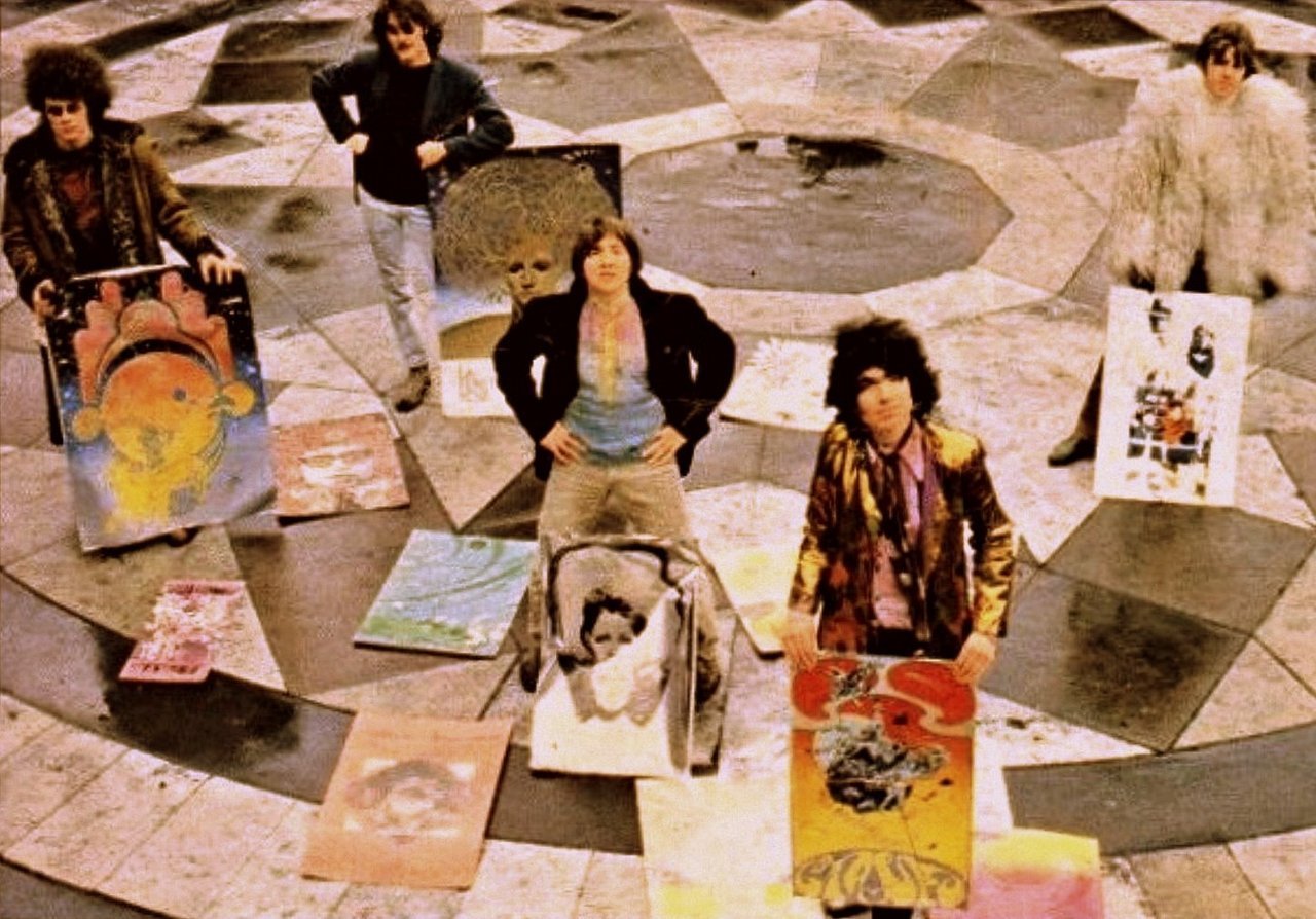
Michael
English, Nigel Waymouth and record producer Guy Stephens surrounded by a
collection of Hapshash and the Coloured Coat posters, 1967.
Nigel Waymouth is best known for his role in setting up the influential and 'hip' clothing boutique Granny Takes a Trip on King's Road, London, during 1966, and for his poster and graphic design work with Michael English. He has also achieved subsequent fame in the areas of portraiture and photography. Waymouth and English operated for a brief period under the monika Hapshash and the Coloured Coat, and between 1966-8 were involved in the production of a graphically intense and brightly coloured suite of music and event posters which lit up the streets of London and venues thereabout. The posters were nothing less than works of art which also pushed the bounds of then current printing techniques in their efforts to reproduce the colours and vibrancy of the psychedelic experience.
Also in London at the time was Australian born artist Martin Sharp who is likewise known for his work with the Big O Posters company and chief graphic designer on the magazine OZ, published in Australia between 1963-9 and London between 1967-73. Both Waymouth and Sharp were unique talents and have left a substantial legacy. Their work is different to, but supplements that of like-mined colleagues abroad, most notably American graphic artists such as Stanley Mouse, Ric Griffin and Victor Moscoso whose posters for music and performance venues such as the Fillmore and Avalon Ballroom helped define the psychedelic genre. This was happening at the same time as their English, Australian, European and even Japanese counterparts were reflecting the spirit of the time. All these poster artists were influenced not only by the revolutionary trends in politics, music and the arts, but also by the flourishing drug culture, with mind expanding drugs such as marijuana, hashish and especially LSD opening the doors of perception for many of them from 1965 through to the end of the decade.
Nigel Waymouth, Mike McInnerney, David Vaughan,
Michael English and Jon Goodchild. English “psychedelic” poster artists from
The Daily Telegraph Magazine, April 1968. Photo by John Marmaras.
Waymouth and Sharp are usually associated through the label psychedelic, though each had distinct styles and subsequent careers which moved on from that genre. They not only worked in the same field during the sixties, but also developed a close friendship. Their most obvious connection was in the production of covers for the London OZ magazines number 4 and 13 which were issued in June of 1967 and 1968. Both featured posters by Waymouth and English as Hapshash and the Coloured Coat. Martin Sharp was responsible for overall art direction of the magazine at the time. This brief association between Waymouth and OZ reflected the casual, yet intimate nature of the London underground at . Richard Neville, editor of OZ and writing in his 1995 memoir Hippie Hippie Shake, Shake, refers to his first meeting with Waymouth and English around April-May 1967:
Leading hippie artists Michael English and Nigel Waymouth, founders of the design trademark Hapshash and the Coloured Coat, came to the door with a complex gatefold of a couple in a kama-sutric embrace.
"All our ideas come from trips," they said, and I thought they meant to India.
"Oh no, psychedelics ...'' The pair insisted on gold metallic ink. "Ok," I said daringly. "Into the mystic."
This cover for OZ number 4 (reproduced below) is a variation on the traditional tantric Buddha image, with a couple entwined in a sexual embrace. It was a spectacular production, printed in gold ink with splashes of yellow and pick interwoven with the figurative elements in black and grey.
Nigel Waymouth and Michael English, Position 70 (Tantric man and woman), cover for OZ magazine number 4, June 1967.
The rear of the Tantric Buddha cover featured a complex set of drawings comprising 20 tarot cards of the major arcana by Martin Sharp, printed in the same colours as the cover, though with an emphasis on black and pink. The front cover poster was subsequently reprinted - without the Sharp images on the reverse - shortly after the magazine appeared, and more recently in an edition signed by Waymouth. The Art Nouveau influences and Aubrey Beardsley frills were typical of the Hapshash style. Martin Sharp rarely reflected such influences in his art, though an obvious exception was the poster produced at the beginning of 1967 announcing the publication of the new London magazine OZ. It was very much in the Beardsley style and a reflection of the popularity of that artist in London, following on a landmark exhibition of his work at the Victoria and Albert Museum during 1966. OZ number 4 was a sales success for a number of reasons, least of all the exceptional art on the cover and Sharp's internal graphics. It was handed out at the Hyde Park rally on 16 July 1967 supporting the legalisation of marijuana and greatly enhanced the acceptance of OZ magazine as a flagship of the underground and counterculture, alongside the broadsheet International Times (IT)
The second OZ combined poster and cover by Waymouth and English appeared with issue number 13 around June 1968. It is less Victorian and more sci-fi, reflecting a space theme.
Nigel Waymouth and Michael English, Catherine and the Wheel of Fire, cover for OZ magazine number 13, June 1968.
The rear of the Catherine and the Wheel of Fire cover featured an advertisement for the various items available through Big O posters, including a number of works by Martin Sharp. A similar colour palette - pink, black and gold - is used for both posters, though in this latter instance it is somewhat subdued without the bright yellow highlights, whilst nevertheless reflecting the Hapshash and the Coloured Coat style. This can be seen, for example, in the Julie Felix at the Albert Hall silkscreen poster of April 1968.

Nigel Waymouth and Michael English, Julie Felix, Royal Albert Hall, 18 April 1968
The gradual bleeding and changing of
colours throughout the poster - from a dark gold at the bottom through to pink, blue and a yellow-gold at the top - was a masterful technique evident in may
of their works. The gradation is somewhat crude in the second OZ poster, and subtle in the Julie Felix print, where the transformation from gold to yellow is quite seamless. Hapshash was responsible for the production of some exquisite examples of this innovative and complex printing technique.
Nigel Waymouth reminiscences of Martin Sharp 2014
Martin Sharp had arrived in London from Sydney in July 1966, after spending three years (1963-5) working on the Sydney edition of OZ magazine and as a cartoonist for local Sydney newspapers and magazines. OZ was filled with his cartoons, drawings and more finished artworks, such as a full-breasted Mona Lisa after Marcel Duchamp which featured on the cover of number 11 of July 1964. When Sharp and Richard Neville decided to launch a London edition at the beginning of 1967 they envisaged that it would be literary, political and highly visual. Over its 48 editions between 1967 and 1973 a number of significant artist from both the United Kingdom and the United States featured, not least of these being Nigel Waymouth and Michael English.
Early in October 2014 the author contacted Waymouth and put to him a set of questions in regards to Martin Sharp and their friendship over the years. The questions and answers are reproduced below:
Nigel Waymouth: I guess it was with the first edition of OZ.
2. MO: When did you first meet Martin Sharp? What were the circumstances of this encounter and subsequent encounters?
3. MO: What was your relationship with Martin Sharp during the period 1966-8? What did you think of him as a person, and his work?
4. MO: It is obvious that psychedelic drugs had an effect on the artwork / posters produced by both Hasphash and the Coloured Coat and Martin Sharp during the period 1966-8. Can you talk about the direct effect of LSD on your work? (This is relevant to Martin's work)
5. MO: What effect did LSD have on the work of Martin Sharp that you can see? It is obvious that there is a major change from his drawings and cartoons for OZ Sydney, with their straight lines and cross-hatching, to the fluid, bubbly work post LSD and evident in drawings such as Wheels of Fire (LP cover) and Sunshine Superman.
NW: I can't speak for Martin on this but I'm sure Martin was as influenced by all the stimuli (not necessarily just drugs but social attitudes and expressions as well) that were part and parcel of London at the time.
6. MO: How long did the effect of psychedelic drugs last on your art work? Do you think the same applies to the London work of Martin Sharp?
8. MO: Did you ever work with Martin Sharp on a specific artwork?
NW: We never collaborated in the way Michael English and I did. I don't think Martin ever did: his work was always sui generis.
9. MO: Did you ever take a trip with Martin?
NW: I can't remember but I'm sure we got stoned together many times!
10. MO: During your encounters with Martin Sharp, what did you talk about? Art? Society? Politics?
NW: We talked about all those subjects and more. Sometime the subjects were wide ranging and sometimes personal. We always had a background of records being played (Martin was big into nostalgia, hence his obsession with Tiny Tim).
11. MO: Can you recall how you saw Martin's art change during that period 1967 through to when he returned to Australia in 1969? It seems to me it became less psychedelic and more painterly with reference to the modern masters such as van Gogh Ernst and Magritte?
NW: Martin was always, during the time that I knew him, a painterly and "messy" artist. Often his pieces were quite large and he'd paint over and over again on what he'd started. There could be many layers in each piece. What was finally printed as a graphic piece was more likely than not flattened and reduced in size as a result of the printing process. From the time when I first knew him he was constantly referencing modern masters. For instance, he was always passionate about Van Gogh. And Mickey Mouse! He loved to collect art books only to cut them up with scissors and make collages. In this he was influenced by Max Ernst and his collage images, such as "Une Semaine de Bonte". You can see that approach in many of his Big O posters. I'm sure he continued in this vein. Like Matisse he was a dab hand with the scissors!
12. MO: What was your relationship with Martin Sharp after he returned to Australia?
NW: Martin and I kept in touch. When he visited London he would always call on me and the one time I visited Sydney I hung out with Martin (as did my son, Louis, when he went).
13. MO: How did you view Martin Sharp's subsequent career?
NW: Martin was always very creative and very interesting. I make no distinction between the various periods of life in London and Australia: Martin was a man of strong vision and distinctive style. It was always illuminating to see his new work.
14. MO: In 2014 how would you assess the work of Martin Sharp, especially his English posters and work with London OZ?
NW: Martin's work in London, his posters, his album covers, were a major graphic force of that time. There were many musicians but very few 1st class graphic artists to illustrate those times, and Martin was a leader in the field.
15. MO: What do you think of his posters Bob Dylan – Blowing in the Mind, and Donovan – Sunshine Superman?
NW: I like the complete freedom of spirit that Martin shows in all his posters. Always he had a great sense of humour - charming and refreshing. They are all excellent.
The Nick Drake guitar
An interesting aside to the friendship between Martin Sharp and Nigel Waymouth is the story of the Nick Drake guitar. It begins with Eric Clapton. Whilst resident at the Pheasantry with Martin Sharp, Clapton made use of a Guild M20 acoustic guitar for practising, composing and jamming.

When he left the Pheasantry around mid 1968 he also left the guitar with Martin Sharp. Nigel Waymouth subsequently moved in for a period and when Martin returned to Australia at the end of 1968 he gave the guitar to Nigel, as he had no use for it. Waymouth made use of it as a prop for his famous photo session with Island recording artist Nick Drake in 1970.

The Waymouth photograph of Drake seated on a chair once owned by Charles Dickens, shoes off and holding the guitar, was used for the cover of the singer / songwriter's second album Bryter Layter. The guitar eventually found a home with Jeff Dexter.
ReferencesNigel Waymouth reminiscences of Martin Sharp 2014
Martin Sharp had arrived in London from Sydney in July 1966, after spending three years (1963-5) working on the Sydney edition of OZ magazine and as a cartoonist for local Sydney newspapers and magazines. OZ was filled with his cartoons, drawings and more finished artworks, such as a full-breasted Mona Lisa after Marcel Duchamp which featured on the cover of number 11 of July 1964. When Sharp and Richard Neville decided to launch a London edition at the beginning of 1967 they envisaged that it would be literary, political and highly visual. Over its 48 editions between 1967 and 1973 a number of significant artist from both the United Kingdom and the United States featured, not least of these being Nigel Waymouth and Michael English.
Early in October 2014 the author contacted Waymouth and put to him a set of questions in regards to Martin Sharp and their friendship over the years. The questions and answers are reproduced below:
--------------------------------------------------------------------
Interview with Nigel Waymouth 2014
1. Michael Organ: When did you first notice the work of Martin Sharp? (Sharp arrived in
London mid 1966 and at the end of the year began working with London OZ which hit the streets in February 1967)
Nigel Waymouth: I guess it was with the first edition of OZ.
2. MO: When did you first meet Martin Sharp? What were the circumstances of this encounter and subsequent encounters?
NW: I met Martin through Bob Whittaker, the Australian photographer who was a
familiar figure on the Kings Road back then. Bob had a studio in
Jubilee Place, behind the Pheasantry. I remember Martin had a Mini-Moke
that we drove about in. He soon afterwards occupied
a studio at the top floor of the Pheasantry. I used to visit him quite
frequently and would meet him at the Picasso cafe over the road.
3. MO: What was your relationship with Martin Sharp during the period 1966-8? What did you think of him as a person, and his work?
NW: Martin and I struck up a friendship. We enjoyed each others company and
Martin liked the company of creative people and his studio was always
open to his friends. He would encourage artists, musicians and models.
At some point in late '66, or early '67, Eric
Clapton, who was well known on the scene as a brilliant guitarist but
not yet an international star, moved into rooms within Martin's studio
with his then girlfriend, Charlotte Martin, as did fellow Australian,
the film maker and artist, Phillipe Mora and
his girlfriend. From then on the studio was more often than not crowded
with all kinds of interesting folk: members of the band Cream, writers
like R.D. Laing and David Litvinoff (who was an important part of life
there), also many of Martin's ex-pat friends
such as Richard Neville and Gary Shearston and, of course, an endless
parade of beautiful young models whom Martin invited to join him at the
studio. When Eric left to move into his newly acquired Surrey house,
Martin suggested I might take over those two
rooms. I was there for about 6 months at the end of '68. I moved out
but our friendship remained positive until Martin left London to return
to Sydney.
4. MO: It is obvious that psychedelic drugs had an effect on the artwork / posters produced by both Hasphash and the Coloured Coat and Martin Sharp during the period 1966-8. Can you talk about the direct effect of LSD on your work? (This is relevant to Martin's work)
NW: It's often assumed that much of the work done at the time was created
under the influence of acid. Not true, as an artist of any sort has to
remain fairly clear headed when working. However, we did smoke a few
joints! This is not to say that the aesthetics
in designs of the period were not influenced by the recreational drugs,
but this has always been true in the arts. Of course, acid and pot were
an integral part of the cultural revolution of the 60s and the effects
of these clearly influenced the designs:
high key bright colours, swirling patterns, surreal visions and
political messages.
5. MO: What effect did LSD have on the work of Martin Sharp that you can see? It is obvious that there is a major change from his drawings and cartoons for OZ Sydney, with their straight lines and cross-hatching, to the fluid, bubbly work post LSD and evident in drawings such as Wheels of Fire (LP cover) and Sunshine Superman.
NW: I can't speak for Martin on this but I'm sure Martin was as influenced by all the stimuli (not necessarily just drugs but social attitudes and expressions as well) that were part and parcel of London at the time.
6. MO: How long did the effect of psychedelic drugs last on your art work? Do you think the same applies to the London work of Martin Sharp?
NW: I don't know how to answer this except to ask how long did Picasso's
Blue Period or Cubism affect Picasso? I guess for ever afterwards in
some way or another. Everyone's youth is highly formative. With
artists, all I can say is that discipline and technique,
as well as passionate inspiration, are paramount. Martin never lost
these, right from the beginning.
7. MO: I recently saw a National Geographic documentary on LSD and it pointed to a 3-6 month after effect on an individual in regards to increased creativity. This seems to have been the case with the so-called psychedelic art of the period 1966-8 and I was wondering if you felt that way? And Martin would be included in that.
NW: As far as I'm concerned that may have been one of the many factors in the creative outpouring of the time. All the drugs in the world are not going to turn a person into brilliant artist: you can't put in what God left out, as they say.
8. MO: Did you ever work with Martin Sharp on a specific artwork?
NW: We never collaborated in the way Michael English and I did. I don't think Martin ever did: his work was always sui generis.
9. MO: Did you ever take a trip with Martin?
NW: I can't remember but I'm sure we got stoned together many times!
10. MO: During your encounters with Martin Sharp, what did you talk about? Art? Society? Politics?
NW: We talked about all those subjects and more. Sometime the subjects were wide ranging and sometimes personal. We always had a background of records being played (Martin was big into nostalgia, hence his obsession with Tiny Tim).
11. MO: Can you recall how you saw Martin's art change during that period 1967 through to when he returned to Australia in 1969? It seems to me it became less psychedelic and more painterly with reference to the modern masters such as van Gogh Ernst and Magritte?
NW: Martin was always, during the time that I knew him, a painterly and "messy" artist. Often his pieces were quite large and he'd paint over and over again on what he'd started. There could be many layers in each piece. What was finally printed as a graphic piece was more likely than not flattened and reduced in size as a result of the printing process. From the time when I first knew him he was constantly referencing modern masters. For instance, he was always passionate about Van Gogh. And Mickey Mouse! He loved to collect art books only to cut them up with scissors and make collages. In this he was influenced by Max Ernst and his collage images, such as "Une Semaine de Bonte". You can see that approach in many of his Big O posters. I'm sure he continued in this vein. Like Matisse he was a dab hand with the scissors!
NW: Martin and I kept in touch. When he visited London he would always call on me and the one time I visited Sydney I hung out with Martin (as did my son, Louis, when he went).
13. MO: How did you view Martin Sharp's subsequent career?
NW: Martin was always very creative and very interesting. I make no distinction between the various periods of life in London and Australia: Martin was a man of strong vision and distinctive style. It was always illuminating to see his new work.
14. MO: In 2014 how would you assess the work of Martin Sharp, especially his English posters and work with London OZ?
NW: Martin's work in London, his posters, his album covers, were a major graphic force of that time. There were many musicians but very few 1st class graphic artists to illustrate those times, and Martin was a leader in the field.
15. MO: What do you think of his posters Bob Dylan – Blowing in the Mind, and Donovan – Sunshine Superman?
NW: I like the complete freedom of spirit that Martin shows in all his posters. Always he had a great sense of humour - charming and refreshing. They are all excellent.
The Nick Drake guitar
An interesting aside to the friendship between Martin Sharp and Nigel Waymouth is the story of the Nick Drake guitar. It begins with Eric Clapton. Whilst resident at the Pheasantry with Martin Sharp, Clapton made use of a Guild M20 acoustic guitar for practising, composing and jamming.

Eric Clapton, possibly at the Pheasantry, with a Guild F-50.
When he left the Pheasantry around mid 1968 he also left the guitar with Martin Sharp. Nigel Waymouth subsequently moved in for a period and when Martin returned to Australia at the end of 1968 he gave the guitar to Nigel, as he had no use for it. Waymouth made use of it as a prop for his famous photo session with Island recording artist Nick Drake in 1970.
The Waymouth photograph of Drake seated on a chair once owned by Charles Dickens, shoes off and holding the guitar, was used for the cover of the singer / songwriter's second album Bryter Layter. The guitar eventually found a home with Jeff Dexter.
Corr, Shiela, Hapshash takes a trip, History Today, 13 September 2011, available URL: http://www.historytoday.com/blog/2011/09/hapshash-takes-trip-sixties-work-nigel-waymouth. Accessed 4 March 2014.
Green, Jonathan, Days in the life: voices from the English underground, 1961-1971, Minerva, 1989, 469p.
Hapshash and the Coloured Coat [webpage], Wikipedia, available URL:http://en.wikipedia.org/wiki/Hapshash_and_the_Coloured_Coat. Accessed 4 March 2014.
Hapshash takes a trip [exhibition video], 2011, 3.45 minutes, available URL: http://youtu.be/vUv0lBkI8Ic. Accessed 4 March 2014.
Look at Life - IN gear, 1967 [video], The Rank Organisation, 1967, 8.45 minutes, available URL: http://youtu.be/kgWQ5ouzuJ0. Accessed 4 March 2014.
Satchell-Baeza, Sophia, Welcome Cosmic Visions - Nigel Weymouth, Shindig, 38, March 2014, 52-9.
Sharp, Martin Ritchie [webpage], Wikipedia, available URL: http://en.wikipedia.org/wiki/Martin_Sharp. Accessed 2 October 2014.
Waymouth, Nigel, Nigel Waymouth [website], available URL: http://www.nigelwaymouth.com/. Accessed 4 March 2014.
-----, Nigel Waymouth [webpage], Wikipedia, available URL: http://en.wikipedia.org/wiki/Nigel_Waymouth. Accessed 4 March 2014.
Comments
Post a Comment